Usability Testing at Cornell University
As a User Interface Specialist for Cornell University, I planned and faciliated usability testing of a website for new students.
Role
- Identified research goals
- Recruited participants
- Wrote test script
- Facilitated user testing sessions
- Analyzed results
- Presented findings
Team
- Software engineer
- Program manager
Tools
- Adobe XD
- Morae
- Google Drive
Background
For over a decade, a website has guided incoming Cornell students through the dozens of requirements to begin their academic careers at Cornell.
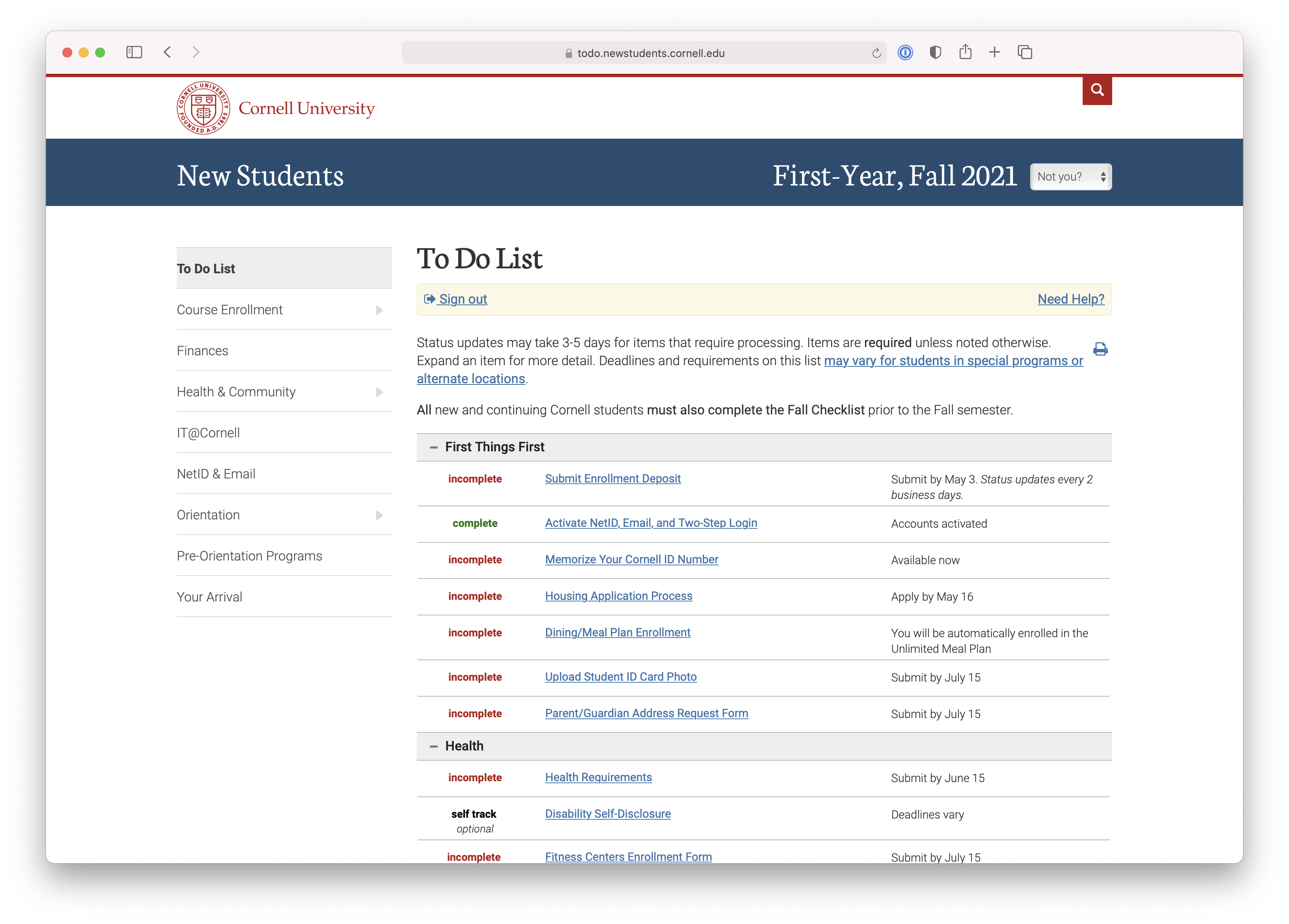
The To Do List on the website is interactive and responsive. As students submit forms, watch videos, and respond to surveys, the items on the list update.

Despite the high visibility of the website, the website had never been tested with users.
Process
Working with my teammates (a program director and software engineer), we identified testing priorities. We wanted to know how students are using the website to complete their requirements and if there are any areas that students find confusing or difficult to use.
Usage metric data and student surveys gave some insight into how students were using the website, but it couldn't provide the why behind the data. For this reason, a user testing study was selected to provide insight into what students thought about the website and identify where the design was working, and identify areas for improvement.
Research Questions
- Can students find the To Do List from the homepage?
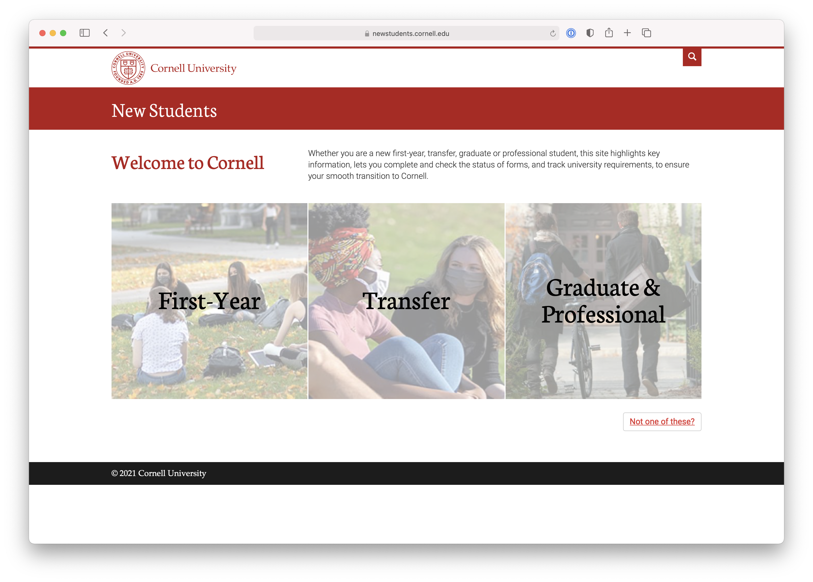
- Can students differentiate between First-Year, Transfer, and Graduate/Professional classifications?
- Do students have a conceptual model of how the To Do List works and how to complete items?
- Do students understand payment options for the fitness form?
Research Methodology
Testing was conducted with a total of 8 current Cornell students, over 50-minute 1:1 sessions. Each participant completed a background interview and a task-based usability exercise. Testing sessions were recorded with Morae usability testing software to document sound and the motions of the mouse on the screen.
Participants
Participants were selected to represent the diversity of Cornell students, with a mix of genders, colleges, undergraduate and graduate students, and international and domestic students.
All undergraduate participants were employees of the Tatkon Center for First-Year Students. As upperclassman, they worked to ensure the smooth transition for new Cornell students to the academic community. As such, they provided special insight into the mind of first-year students and were familiar with the challenges facing this demographic.
Graduate student participants were PhD students in the College of Arts and Sciences. As the requirements for graduate students differ from undergraduates, as does the college experience, graduate student participants were selected to provide another perspective on the website.
Session Organization
Each test participant took the perspective of a student who had been accepted to Cornell. Participants were asked about their program and experience as a first-year student. Participants used a talk-aloud protocol to describe their experiences using the site.
Participants were asked to give their general first impressions of the site, then asked to complete the fitness form and apply for health insurance. Participants were also asked how they believed the To Do List worked, and their perception of complete, incomplete, and self-track items. Participants were redirected when necessary.
Starting with P5, participants were shown two versions of the graduate sign in page, the original and a mockup I created in Adobe XD, and asked to share their thoughts and talk through their process. Following P5, the prototype design was revised with input from P5 and team members.
Findings and Recommendations
Self-Track and Optional Items are Unclear
"I don't like having optional in the middle of things that aren't optional.”
“I find it weird it's self-track for things that are required, but there's incomplete for optional things.”
Participants had a clear mental model of how the website worked for To Do List items that were labeled incomplete and complete, understanding that they needed to take action to change the item status. However, for items marked self-track, indicating it was an item that the student had to keep track of themselves, their mental model was less clear. Some students incorrectly thought that they could still change the status of the item to complete, or that the item was optional. Two testers noted they might skip over an item since it wasn't marked incomplete.
Recommendation:
- Consider alternatives to self-track to reduce mental load, such as a "mark complete" button
- Add filtering functionality so students can hide optional items
Cornell Fitness Center Form User Friendly
The fitness form was well-received with two exceptions. First, every participant missed the callout with the Fitness Center contact information. One participant stated he didn't see why contact information was necessary on the form since he could easily Google the information. Second, participants wanted the ability to pay by debit/credit card. Most participants quickly understood money would be charged to their Bursar account.
Recommendation:
- Reposition the contact information to the left side of the form, add contact information to the item on the To Do List instead of the form, or remove entirely.
- If possible, allow students to pay for their membership using a debit/credit card rather than their bursar accounts.
Graduate Sign in Protoype Well-Received
“I think it's a little confusing. Having the sign in on the right makes it a little cluttered.”
Participants stated the current sign in page checking for duplicate graduate student accounts looked dated. The prototype was positively received; however, participants may have been biased since both pages were not shown in XD.
Recommendation:
Despite the positive response to the prototype, the purpose of the page should be revisited. Consider restrictions to allow only users with a Cornell NetID to sign in to the website, rather than allowing users to register an account with an outside email.
Student Status Confusing to Graduate Students
“I thought I was a first-year graduate student. Oh, does first-year mean freshman?”
A few graduate students tested were unsure if they were considered "First-Year" students or "Graduate and Professional," given that they were first-year graduate students when they began their programs. One graduate student selected "First-Year" from the homepage.

Participants noted that transfer students may also consider themselves first-year students. Google Analytics data showed it was not uncommon for students to end up on the wrong To Do List (e.g., a graduate student using the To Do List for first-year students).
Recommendation:
- Automatically redirect wayward students to the correct To Do List on sign in
- Make the differences between student types more obvious (e.g., "undergraduate first-year student") so students begin with the correct To Do List
Misc. Findings
Color Presents Challenges to Some
A participant with colorblindness noted difficulty differentiating incomplete and complete items as the colors (red and green), looked nearly identical. As such, it was difficult for them to skim through the list of items to check for “incomplete” items. A checkbox or other visual cue should be considered as an indicator to show item status.
To Do List Has Many Items
Almost all participants commented on the high number of items students need to complete. Some wondered if these items were necessary and if there was a way to hide or filter items. Some participants wanted additional functionality, like sorting items by due date and the ability to check off items, similar to how a person would check off items on a to do list using pen and paper.
Revisit Wording and Links
A few participants noted the To Do List items contained many links. One student noted the number of links in an item might be confusing, stating if the purpose of the To Do List was for the user to complete an action, that action should be obvious. Links to more information might detract from the action that needs to be taken (e.g., applying for health insurance).
Reflection
The research participants were fantastic. Each gave exceptionally thoughtful answers and I'm grateful for their feedback. Our team implemented many of the suggestions and reworked areas where participants struggled. While the study was successful, I would make the following changes:
- Schedule time between participants for a debrief (some sessions were back-to-back). This would have given me a chance to immediately document my thoughts and I could have relied less on my notes and video documentation.
- Send a friendly introductory email to research participants explaining what to expect during a user testing session.
- Test with new users rather than current students, ideally recently admitted Cornell students.
- The graduate sign in page should have been presented to avoid bias. Recreating the original page in Adobe XD and alternating the order shown with the prototype may have produced a different reaction from research participants.
Future Work
The balance between displaying needed information while also indicating to users what action needs to be taken and when, should be discussed with campus partners. Some participant suggestions, including the ability to sort items by due date or finding a way to have a “complete” or “incomplete” status for each item rather than “self-track” will be explored in future cycles.
For more information about this and other projects, email me at karenhawkinson12@gmail.com